Rideau Sports Centre
Brand Identity, Package Design
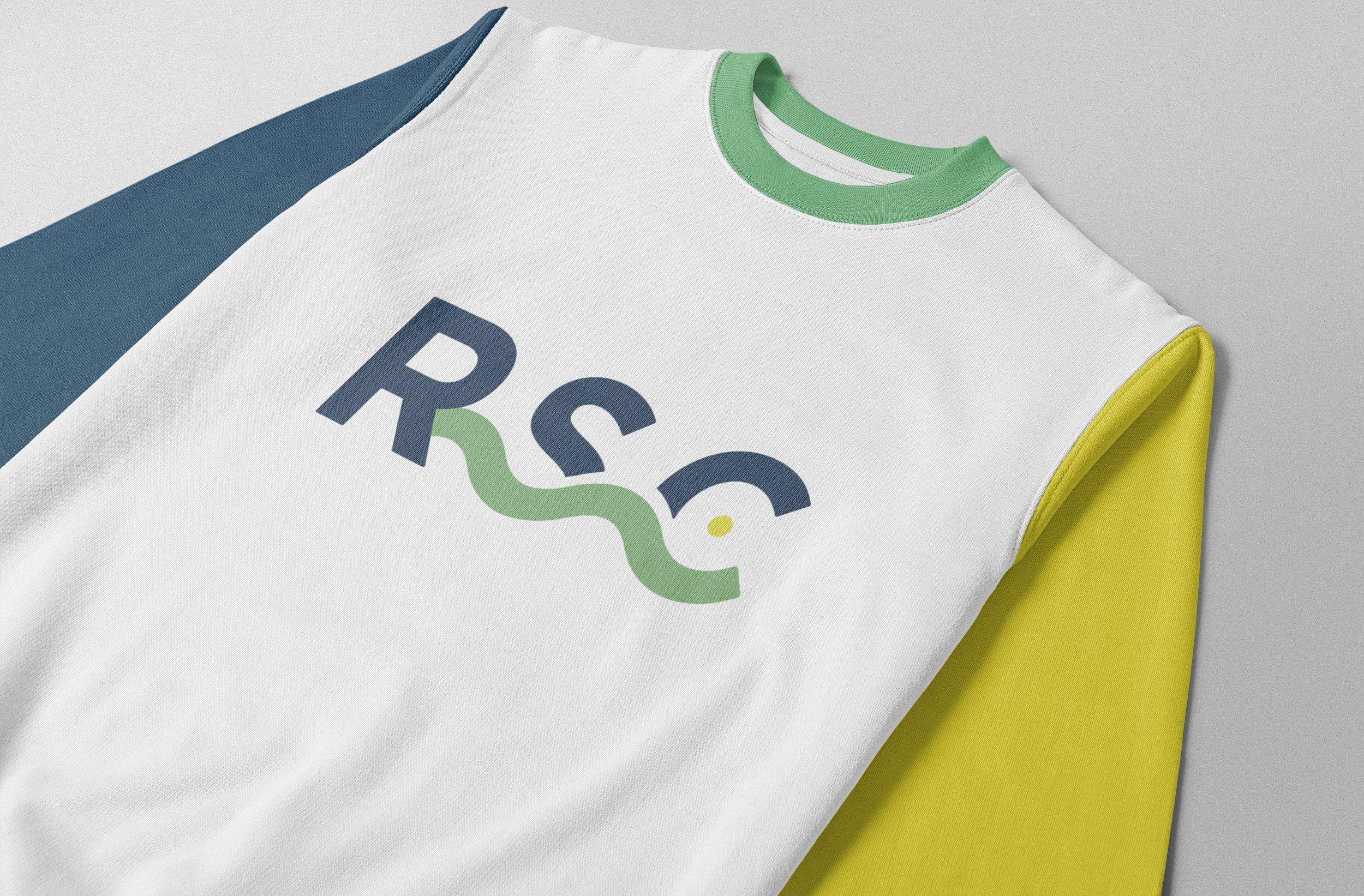
The Rideau Sports Centre (RSC) is a multi-purpose recreation facility that acts as the heart and hub for the city of Ottawa. RSC required a sophisticated, yet leisurely and accessible brand identity to embody its active, welcoming facilities and community environment. The final logo captures this sense of balance, vibrancy, safety, and belonging. The circular shape, representing both the sun and an athletic ball, illustrates the warmth, recreational nature, and inclusivity of the centre, as well as its position at the core of Ottawa's active community. The adjoining wave symbolizes movement and connection to the Rideau River; blue when the logo is placed on a dark background to symbolize water sports and activities, green when placed on a lighter background to reflect land sports and activities. The logo's overall colour palette celebrates the natural beauty that surrounds the RSC, and complements the inviting atmosphere the centre has created within the community.
Credits: Designed in-house at Cinnamon Toast New Media Inc.


